
The Dark Aesthetic: Why Feed Posts Look Nothing Like Listing Photos
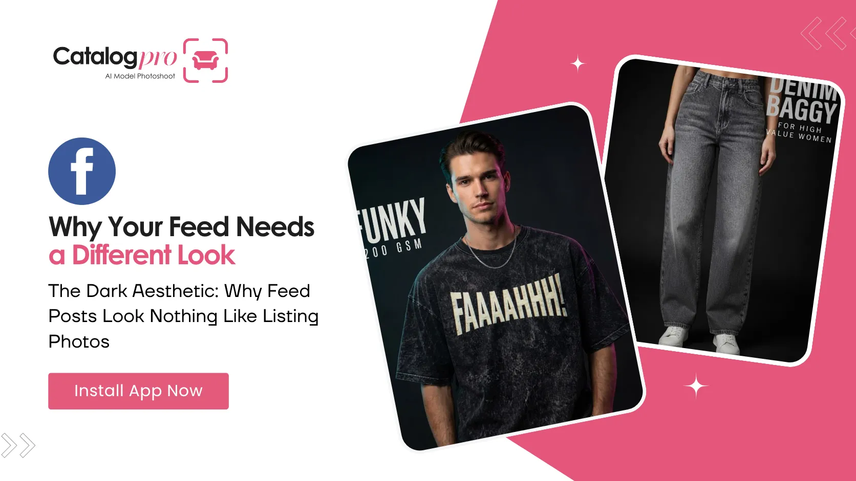
Put your best Meesho catalog image on Instagram and it dies. Not because it is a bad photo — because it is a photo built for a completely different job.
Two Opposite Briefs
It is worth being blunt about how far apart these two things are:
- A listing image is locked to a marketplace spec. Plain light backdrop. Fixed aspect ratio. The whole product visible, edge to edge, nothing cropped. Even, flat light so there is no doubt about the colour.
- A social post is the opposite on every axis. Dark. Editorial. Tightly cropped. The garment or the object decides the frame, not a rulebook.
They are not two settings of one photograph. They are two different photographs, and trying to make one image do both gets you something that fails at both.
Why Dark Wins on a Feed
Three reasons, and none of them are about taste.
It separates. A feed is a white column. A dark image is a hole in it, and your eye goes to the hole. A white-background product photo blends straight into the app around it.
It makes the product the only thing with colour. On a near-black backdrop the one saturated thing in the frame is what you are selling. On a white backdrop everything is bright, so nothing is.
It reads as expensive. Deep blacks and one strong light are what campaign photography looks like, and everyone knows it without being able to say why.
The Five Backgrounds
Catalog Pro's Socials flow gives you five, each with a plain description of what it does, so you are picking a look rather than a word:
- Dark studio — a plain black background, soft light on the front and a bright edge down one side. Rich blacks, no grey haze, no visible floor line. This is the default, and it is the right answer most of the time.
- Neon lights — dark background with cool cyan on one side and warm magenta on the other, so the subject picks up two coloured edges against an unlit centre. Bright and modern. Good for streetwear, tech and anything aimed young.
- Warm sunset — golden light and a deep amber-to-brown background, darkest at the corners, like late evening sun. The warmest of the five. Good for ethnic wear, leather, wood, skincare.
- Concrete wall — a grey concrete wall softly out of focus, one hard light carving an edge along the subject and leaving the wall in shadow. Plain and a bit rough. Everything is monochrome except the product itself.
- Black & white — no colour at all. Black, white and grey, one hard key and a bright rim. Use it when the shape is the story and the colour is not.
The Lighting Is the Part That Matters
Every one of those backgrounds is really a lighting instruction, not a colour. That distinction is the difference between a post that works and a black rectangle with a product lost in it.
The thing doing the work is the rim light — the bright edge running down one side of the subject. Without it, a black t-shirt on a near-black wall is a smudge. With it, the silhouette snaps away from the background and the garment reads instantly, even at thumbnail size. That is why "dark background" alone is not a style and why picking from the list beats typing "black background" into a box.
Keep Both Sets
None of this means your listing photos are wrong. They are exactly right where they live. Amazon and Meesho will reject a moody, cropped, half-shadowed image, and they should.
Make both. The clean set goes to the marketplace. The dark set goes to the feed that sends people to the marketplace in the first place.
Ready to Try It?
Download Catalog Pro and make your first social media post in under 2 minutes.
Download Catalog Pro — Free to StartMore Tips for Sellers
Social Media Posts From One Product Photo
The whole flow, start to finish — category, photos, look, headline.
Instagram Posts for Clothing Brands: Editorial Shots Without a Photoshoot
How clothing sellers get moody, model-worn feed posts from a photo of a hanger.
Product Social Media Photos: Make an Object Look Like a Campaign
Five ways to shoot a product for the feed — spotlit, floating, close-up and more.