
Instagram Post Size for Sellers: Portrait vs Square
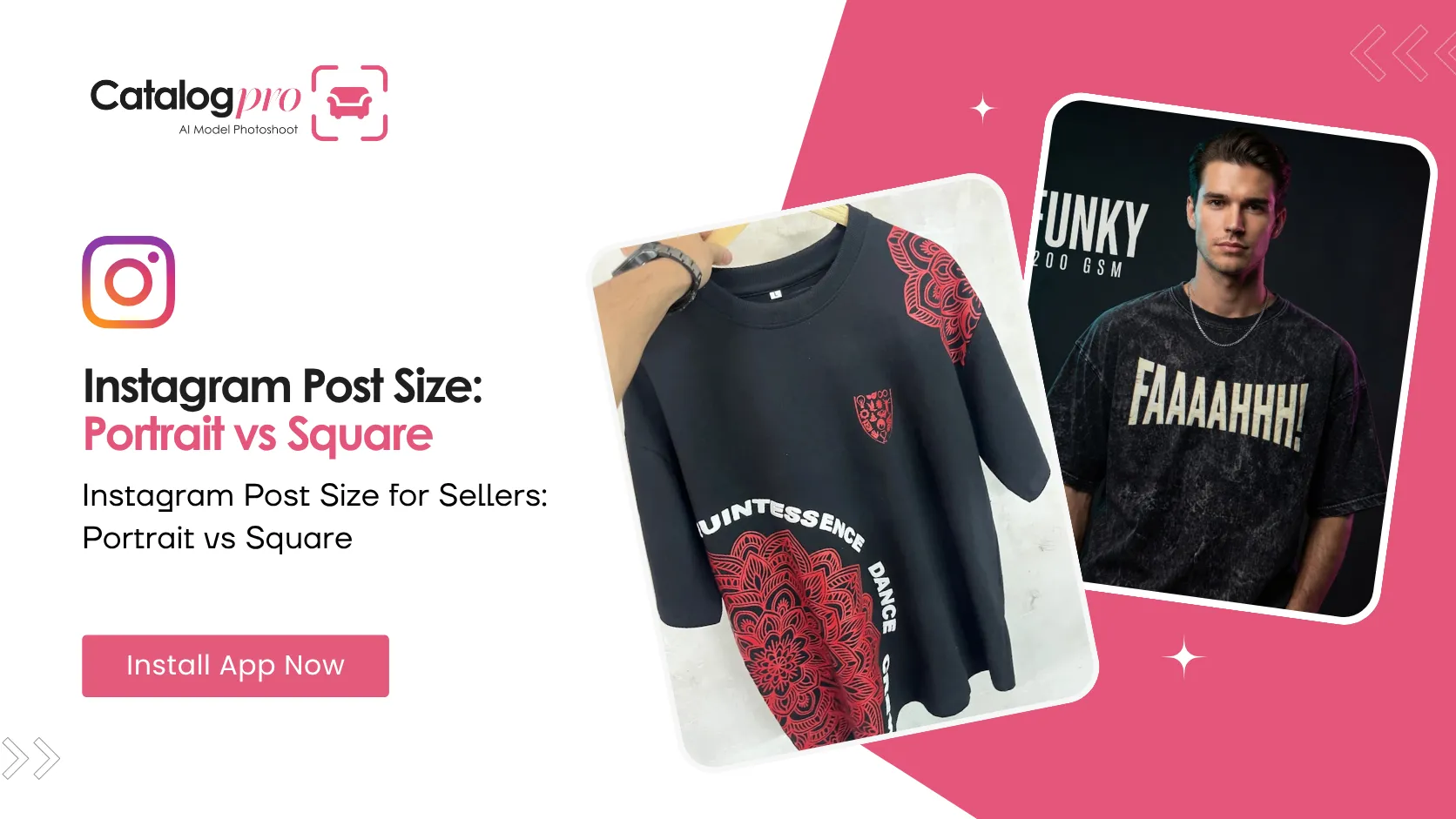
Two sizes, one decision, and most sellers pick the wrong one out of habit.
Square was the original Instagram shape and it stuck around in everyone's head long after the app stopped preferring it. On a phone today a portrait post simply takes up more of the screen — and screen space is the entire game.
What Catalog Pro Gives You
The Socials flow has exactly two output sizes:
- Portrait — 768 × 1024 (a 3:4 frame). This is the default.
- Square — 1024 × 1024 (1:1).
Both are ready to post as they are. You pick the size before you generate, so the framing is composed for that shape rather than cropped into it afterwards — which matters more than the pixel count does.
Why Portrait Is the Default
Because a feed post is portrait, and square wastes the half of the frame that makes a product read.
Think about what a square does to a full-length dress: it either shrinks the figure until the garment is a detail, or it crops the hem off. Neither is what you wanted. A taller frame lets a garment run from shoulder to hem at a size someone can actually see while scrolling.
The same is true for a spotlit product with a long shadow, or a model shot with a rim light down one side. The composition has vertical space in it. Squaring it throws that away.
Portrait also gives your printed headline somewhere to live — there is room above or below the subject for the type without it sitting on top of the product.
When Square Is Actually Better
Square is not a legacy option. Reach for it when:
- The post is going in a grid and you care how the profile page looks as a whole. Square is what a profile grid crops to anyway.
- The subject is wide or flat — a watch laid down, a pair of shoes side by side, a folded stack.
- You are reposting the same image somewhere else that expects a square, and you would rather not think about it twice.
- You want a tight close-up on material, where there is no vertical story to tell.
A Simple Rule
- Clothing on a model — portrait. Always. The garment needs the height.
- A single product, hero shot — portrait, because the shadow and the space above it are part of the picture.
- Detail and texture close-ups — square is fine, sometimes better.
- Anything you are planning your grid around — square.
What About Stories?
Stories are a taller 9:16 shape, and neither of these two sizes is that. A portrait post shared to a story sits in the middle of the screen with space above and below it, which is perfectly normal and is what most brand accounts do — add a sticker or a link in the empty space and it looks intentional.
Do Not Confuse This With Listing Sizes
These sizes are for social posts only. Marketplace listings have their own rules — Meesho, Amazon and Myntra each specify their own dimensions and formats, and none of them want a 3:4 editorial crop.
Catalog Pro handles those separately: the listing flows output at the size the marketplace asks for, and the socials flow outputs at the size a feed wants. Different jobs, different files.
Ready to Try It?
Download Catalog Pro and make your first social media post in under 2 minutes.
Download Catalog Pro — Free to StartMore Tips for Sellers
Social Media Posts From One Product Photo
The whole flow, start to finish — category, photos, look, headline.
Instagram Posts for Clothing Brands: Editorial Shots Without a Photoshoot
How clothing sellers get moody, model-worn feed posts from a photo of a hanger.
Meesho Image Size Guide: Product Photo Dimensions and Requirements
Recommended dimensions, file formats, and photo requirements for Meesho listings.